
Monday, June 20, 2005
Captain Cheese Quantified
Yes, I know you've all been waiting for this...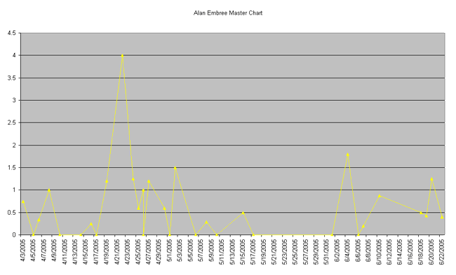
Above is a slightly more technical analysis of Alan Embree's relief outings this year.
We can plainly see from the pattern on this graph that El Capitan del Queso's next outing will be an excellent one. Since Tito doesn't have access to my fine pitching-prediction skills, surely he will be afraid to use Alan in a game we might actually win. Embree's quality outing will be wasted on a game we are losing by three runs or more. Not that I blame him... But surely I am not the only one who has noticed this distinct pattern?
Below is an explanation of PEI and how it is calculated. The larger the PEI, the suckier the pitching.
# posted by Rebecca @ 11:23 PM 
Comments:
<< Home
The entire PEI concept and what you've done with it: pure genius. (But don't think someone won't tell you 50 things wrong with it. If they do, LOB a LOOGY at them at WARP speed.)
Got to see Cheese do GREAT live in Cleveland tonight! In case you can't tell, I'm being sarcastic--he stunk like an elephant's butt, and I stared a hole through his soon to be cut chest as he walked off the mound.
Got to see Cheese do GREAT live in Cleveland tonight! In case you can't tell, I'm being sarcastic--he stunk like an elephant's butt, and I stared a hole through his soon to be cut chest as he walked off the mound.

I haven't had the time to study this just yet, but I wanted to express to you how very impressed I am with the effort you've put into it. Bill James would give it two enthusiastic thumbs up. You rock, woman.
Damn, Reb, graphs and everything... very nice work on this one.
The geek in me would find it interesting to see a cumulative line of PEI as compared to a league average, or some such thing. Very interesting stat.
The geek in me would find it interesting to see a cumulative line of PEI as compared to a league average, or some such thing. Very interesting stat.
# posted by  : 11:50 AM
: 11:50 AM
Andrew, this data took an unbelievably long time to compile. I, too, would like to see a league average, etc. perhaps in time. but I really can't imagine doing all the work to get it. Perhaps I'll chart the PEI of opposing pitchers occasionally.
Oh, believe me, I wasn't pushing you to do so... just thinking out loud in print. I can't even imagine how long this took, given the level of detail in the stats. Again, very cool peice of work.
# posted by : 12:06 PM
: 12:06 PM
A very interesting statistic. It seems like a good way to compare/contrast the pitchers on the Sox staff. Nice work.
Call up SABR!
-MRhe
Post a Comment
Call up SABR!
-MRhe
# posted by : 3:59 PM
: 3:59 PM << Home
![]()